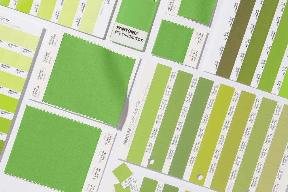
Pantone Announces the Colour for the Year 2017 – Greenery, Representing Hope for a Better Year Ahead!
Every year around this time, the Pantone Colour Institute announces a colour for the upcoming new year. For the first time since the company started this tradition 16 years ago, 2016 was a dual colour selection of Rose Quartz & Serenity (Pantone 13-1520 & Pantone 15-3919).
This year its Greenery (Pantone 15-0343).
The company began to select these colors back in 2000, and while it does not focus on directly creating merchandise in the color of its choosing, the selections have proved to be fairly influential in the past.
The process itself is based more on intrinsic hunches than on scientific data. So why this particular shade of yellow-y green for this year?
According to Vogue.com Greenery could mean green with envy over the Obama era that we are leaving behind? Green because the grass is always greener on the other side aka it’s actually time to move to Canada now? Green as a reminder that the environment will be in peril under a Trump presidency? Not quite.
Our take and BN Living? The dual colours of 2016 are reminiscent of the symbols of a new day – sunset, sunrise. And now in 2017, the idea of a new beginning continues with this vibrant green, filled with life and so much energy. It’s also a symbol of life and hope, again “the grass is greener on the other side” – in our case, a hope for a better Nigeria on the other side of 2017. Green is present in our flag anyway, so let’s stay hopeful!
Leatrice Eiseman, Executive Director of the Pantone Colour Institute, has confirmed as much with his statement to get you into an optimistic mood for 2017 saying;
“Greenery bursts forth in 2017 to provide us with the reassurance we yearn for amid a tumultuous social and political enviroment. Satusfiying our growing desire to rejuvenate and revitalize, Greenery symbolizes the reconnection we seek with nature, one another and a larger purpose.


No comments: